Folx: A Meet-Up App for Meeting Folks
Client: Folx
Type: UX / UI, Web Design
Year: 2019
Client Brief
I was tasked with building a hobbyist meetup/finder that allows users to create events for free or works with Eventbrite for payments. It was designed to help people connect face-to-face with other people who have similar interests and hobbies.
Logo
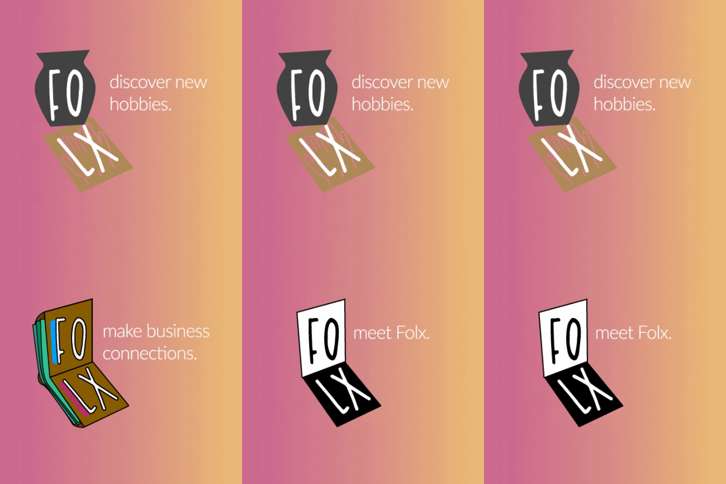
The Folx logo is adaptable for different applications. Though the typeface and basic double square shape remain consistent throughout, the concept is highly flexible and can be adapted to match various color schemes, themes, featured photography, etc.
Personas
Two main types of users: 1) those who want to host their own events and 2) those who want to attend events. In order to better empathize with all the different possibilities of why someone would use this app, I created two provisional personas, as well as their needs, goals, pain points, and use cases.
Wireframe sketches
Adapting wireframe sketches for digital wireframes. The final step before building the final web app.
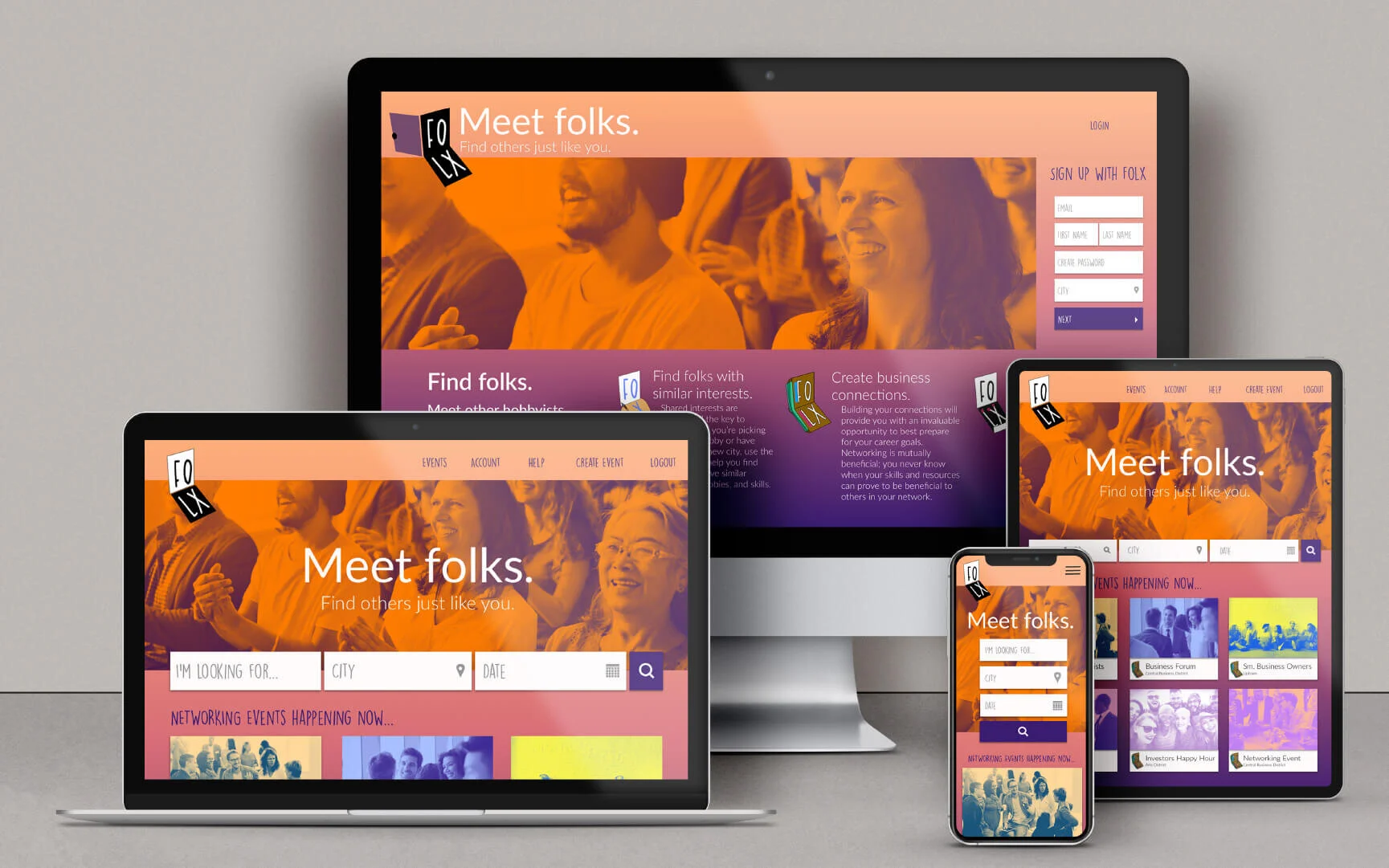
Responsive home screens designs
Usability Testing
20+ users participated in a survey, a card sorting activity, and usability testing. All of the users I tested were between the aged of 26-35 and considered themselves to be tech savvy app users who were familiar with Facebook, Meetup, and Eventbrite.
Pain Points
Established based on user feedback from survey and usability testing, as well as provisional personas.
Prioritizing Needs
Utilized card sorting results to identify structure of functionality.
Solutions
Separated functionalities based on card sorting results into 2 main structures: essential functions and tertiary functions.
UI Sketching
Used paper and pencil to sketch preliminary ideas for screens in 3 viewports: desktop, mobile, and tablet. Used feedback from these sketches to inform the building of wireframes.
Responsive account screen designs
Responsive search screen designs
Prototype
Used Sketch and Invision to build wireframes and prototype; heavily informed by expert feedback and usability testing.
Industry Research
Primary competitors: Meetup, Facebook, Peoplegogo, GroupeSpace, MeetIn
3 Distinct Users
The New Comer
The Entrepreneur
The Knowledge Seeker
Branded landing page mock up
Responsive web design mock ups


