Outside In: Rebranding my Journey as a Designer
Client: Outside In Design Studio
Type of Work: Logo Design, Web Design
Year: 2020
Now a fully licensed business and LLC, Outside In Design Studio started from humble beginnings. In 2017, I was a disgruntled school teacher that decided to quit her job and enroll in a digital design program. In 2018, I started freelancing under my own name, Hannah Gregory Designs. After some success, I decided to take the plunge and founded Outside In Design Studio! This undertaking included a lot of work, namely hiring some experts, filing lots of paperwork, and a major rebranding that included a new logo, identity package, website, and social media strategy. I had a vision for something modern and quirky that was reflective of my personality and interests.
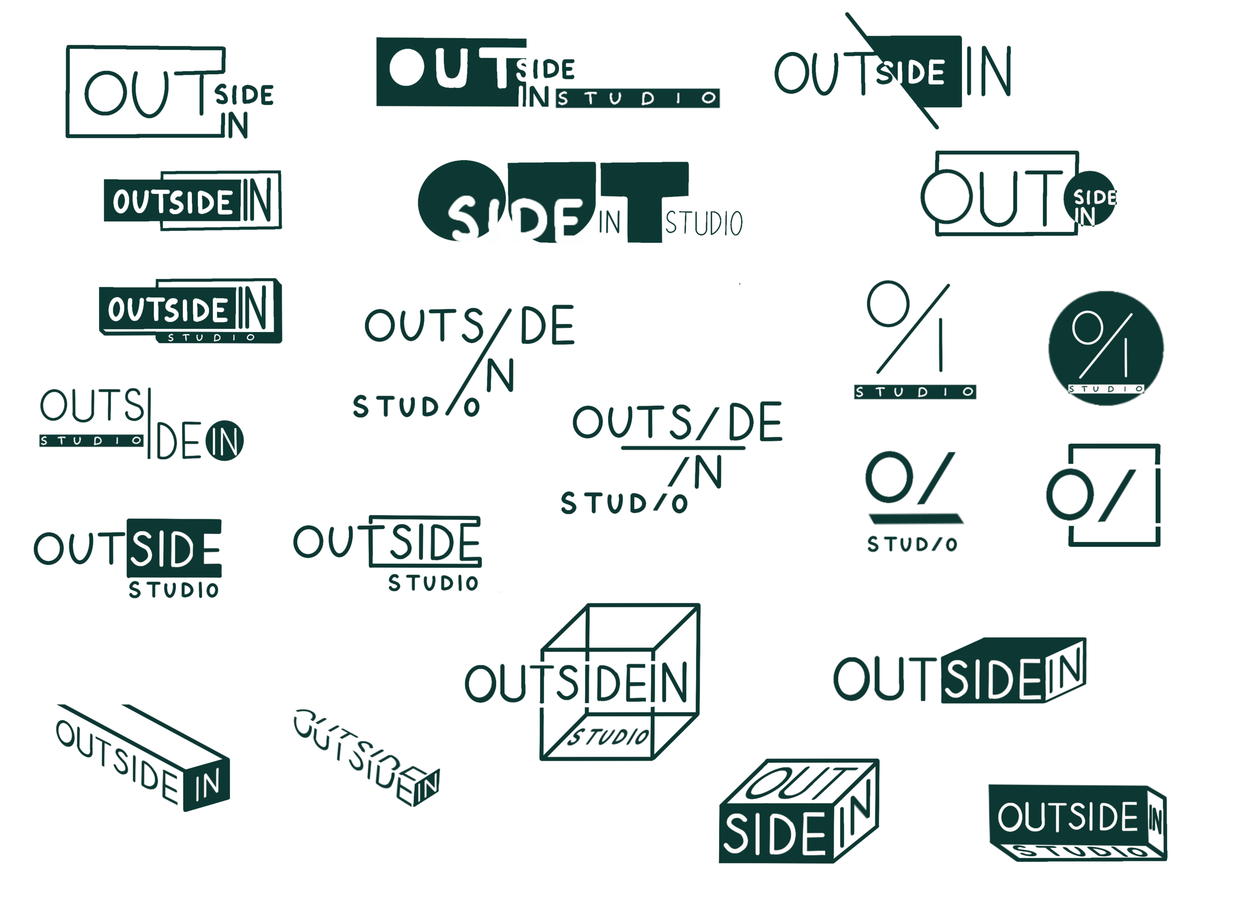
The logo was driven by two key concepts that are near and dear to me. The first was the promise of “outside the box design thinking.” I wanted clients to know from the get-go that they were coming to me for unique design ideas. The second is representative of a staple ultimate frisbee throw: the outside in. Ultimate frisbee is a hobby and passion of mine.
As I was designing my logo and website, I came up with stylized graphics to be used as part of my branding and identity package. My friend described the style as “retro tech boom aesthetic.”
The newly designed Outside In adaptive logo.
Handrawn wireframes for the website. I skipped the digital wireframes part since I had a good idea of how it was going to look and didn’t need to go through the usual client approval process - easy to do when you’re your own client!


